Gray. This color may have outlived its moment in the trends, but it has seen many trend cycles and lived to tell the tale. There is no reason to write it off completely. The right gray can do wonders for a space, is a great alternative to other neutrals, and can work in almost every design style. And while gray on gray everything is dated, there’s no need to avoid it simply because it’s no longer the top trend.
Below are a few of my absolute go-to grays. These colors will read as classic, not trendy, so you can focus on picking the perfect gray without the stress. My insight built from hours of agonizing over every gray paint color known to man is my gift to you on your color selection journey. Keep on reading to share my lessons, professional tips, and favorite real-life projects to help you pick the right gray for your new space.
Dunn-Edwards DEW395 Heirloom Shade
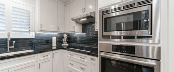
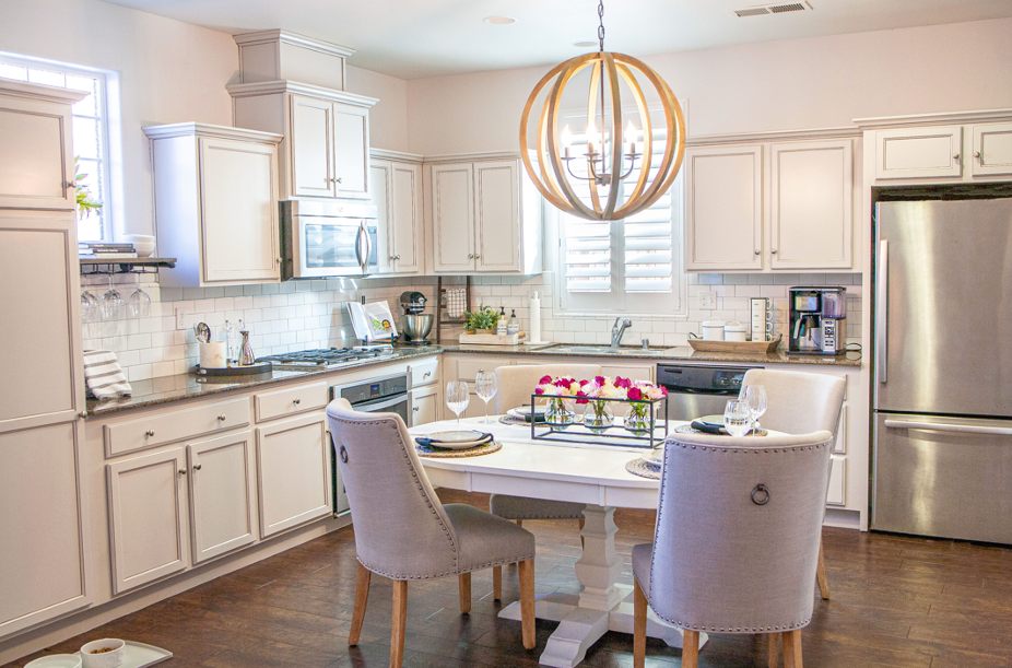
This barely-there light gray is part of Dunn Edward’s white color palette. This shade of gray is a great cabinet color for those who like white kitchens but want more pigment and depth. It hovers on the borderline between white and gray, so it is great for those noncommittal folks who want the best of both worlds. Take a look at a real-life project where Heirloom Shade is the star.
Why it Works
For this kitchen remodel, we needed a gray cabinet that still worked with a warm brown color pallet, as new granite and floors were not an option. A hint of glazing on the cabinets added a classic element to otherwise standard builder-grade cabinetry and added just enough warmth to support the brown granite counters.
Life Lesson
Brown granite is admittedly not on everyone’s dream kitchen wish list. But when budget constraints dictate that you work with what you’ve got, you need to focus on how to make the most out of colors you may otherwise not choose. Dunn Edwards Heirloom Shade was just gray enough to cool down the warm brown floor and countertop and modernize an otherwise traditional color scheme in a way that a white paint never could have.
Pro Tip
Since the cabinets needed to be the star of the show, we opted to paint the walls in the same color at 75% intensity. This trick is great when you need a monochromatic look or just can’t seem to find the right accent color. When paired with classic white subway tile and white millwork, the result is a sophisticated, layered, monochromatic look ranging from airy light gray to bright white. The eye registers the depth of color almost without knowing why.
Sherwin Williams SW 7029 Agreeable Gray
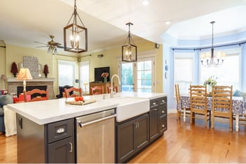
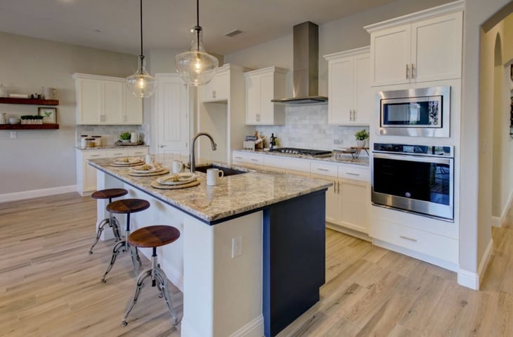
Agreeable Gray is, time and time again, the most versatile paint color I have ever used. This color is considered a warm gray but often acts as a chameleon, picking up the undertones surrounding it. It’s beautiful with brown or black accents but also works with other shades of gray and more saturated accent colors. Its warm base works well with traditional wood floors and works with many of the gray flooring options on the market right now, making it an easy choice for both remodels and new builds. While I have dozens of projects utilizing this color, the photo below shows just how neutral this color behaves. It sits in the background of this home, creating a creamy light gray backdrop, allowing the white cabinets to pop, but also complimenting the blue accent on the island, wooden barstools, and metal fixtures. When you choose to layer shades of gray together, odds are this color will be the winner.
Pro-Tip
A key component of choosing the right paint color is considering its light reflective value (LRV). LRV is a scale used to measure visible and usable light that is reflected from a surface when illuminated by a light source. Simply put, this is how much a paint color will work to lighten or darken a space. LRV is rated on a scale of 1-100. The closer to 100, the brighter and more reflective the color. With an LRV of 60, Agreeable Gray is just dark enough to add contrast to white trims but just light enough to work in most spaces with average light. This is just one more reason I keep coming back to this color over and over!
Sherwin Williams SW 7643 Pussywillow
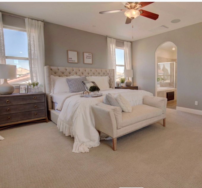
Part of Sherwin Williams's Timeless color palette, this gray paint color is great for achieving a saturated, sophisticated base color in a room. Great for bedrooms, offices, or living rooms, Sherwin Williams Pussywillow is one of the first colors I look at when a client wants accent walls without committing to too much color.
Pro Tip
I usually pair this color with white ceilings and reserve it for spaces with good natural light. It has an LRV of 42, so it can definitely darken a room. As a darker gray neutral, this color works best when complimented with shades of cream, white, and ashy browns. Adding in a hint of burnished brass or black metal accents through hardware or light fixtures also takes this color up a notch. This color pairs well with Sherwin Williams Natural Choice and SW Pure White.
Sherwin Willams First Star
First Star is part of Sherwin Williams’ white color palette. This one is considered a cool white. It presents as a very pale gray with blue undertones. While subtle at first, the blue undertones shine in rooms with lots of light, especially north-facing rooms, which receive cooler, moodier natural lighting than others. In south-facing rooms with warmer natural light, this color will lean towards a “truer” gray. It has an LRV of 69, meaning it is on the lighter side and makes a good all-over base color for most spaces.
This color can act as a chameleon, reacting to the lighting and colors around it. One of my favorite ways to use this color is in spaces with warm finishes, pops of color, and bright, crisp white trims. For example, in this project below, First Star is paired with deep, warm hardwood flooring, a creamy textured stone fireplace, and trims painted in Sherwin Williams Extra White. It is important to pair this color with clean, cool white trims. Using a creamy or warm white will look a bit dingy when compared to First Star, and it will work to emphasize the blue undertones even further.
.jpg?width=725&height=490&name=living%20room%20interior%20designed%20with%20rug%20couch%20fireplace%20coffee%20table%20two%20lounge%20chairs%20and%20floating%20tv%20in%20fresno%20remodel%20(1).jpg)
Life Lesson
When furnishing this space, we took extra care to layer in pops of complementary colors. Pairing a cool paint color with warm neutrals modernized the aesthetic and created a clean background to layer in bold décor. Since First Star has a deep blue undertone, this meant layering pops of orange and coral, reflected in the wooden accent tables, stained mantle, pillows, golden accented artwork, and the natural woven lamp shade. The result is a space that feels warm yet modern. The hint of blue on the walls adds a subtle energy to the décor that would otherwise feel very traditional with a warmer backdrop.
Pro Tip
Gray walls do not always equal a cold space. Sometimes focusing on color compliments, or opposites on the color wheel, emphasizes warm features in a way that a more monochromatic color scheme would not accomplish. Choosing a cool neutral wall color like First Star is the perfect backdrop for bold, warm colors.

